

You must log in or register to comment.
I prefer it to most ui these days, tbh. Everything is either hypergeometric and boring, or forces mobile website design into desktop use for no good reason.
Your lack of sorting makes it look worse than it is.
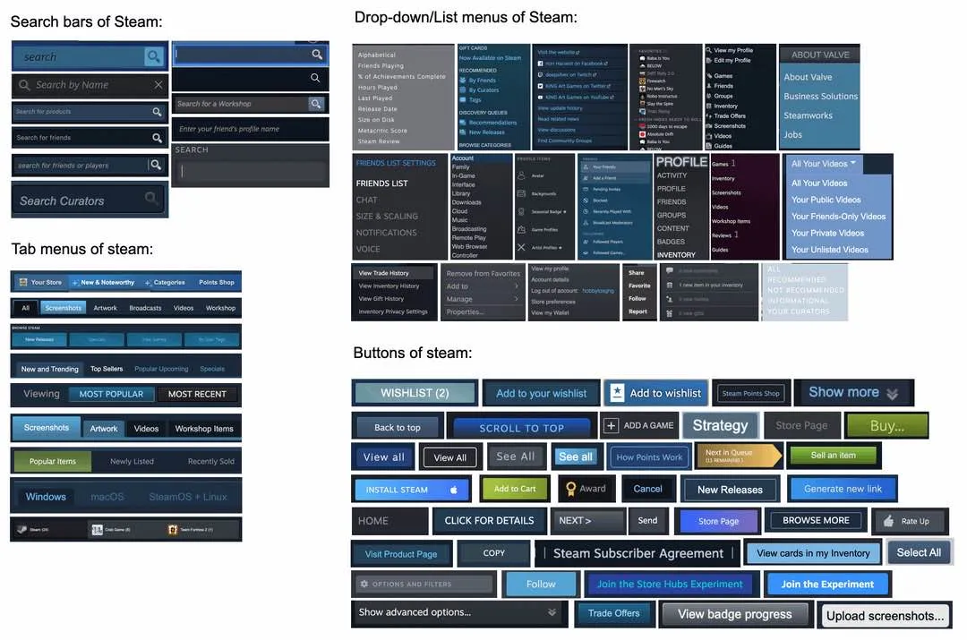
Just looking at the buttons, they clearly have design documents, green is only used on buttons dealing with money.
Blue buttons primarily deals with social interactions or midrange store tasks
Grey buttons are for the local client
That would be 3 buttons not 40 like in the picture
No?
I only mention colors, not styles.
I have no trouble using it in spite of this.
I think it’s actually very nice for the different areas of the program to have a distinct visual identity.
Imagine making the same type of image about your own furniture. A mish mash of a bunch of different items and styles, but when you put everything together it just looks like home
I have never noticed this. Shows how the average consumer doesn’t really care about consistent design languages.
Given Valve’s history of taking play testing really seriously, I wonder if this is something they’ve realized through user testing?